
Note: this case study is still ongoing. UX Research and Analysis are available and the wireframes are WIP.
While reviewing The Witcher 3’s interface, I found that the main UX issues are not caused by the game’s complexity alone, but by how that complexity is organized and surfaced to the player. The game supports a large number of interconnected systems (inventory, alchemy, crafting, bestiary, quests, map navigation and combat preparation) but players frequently report difficulty finding relevant information, comparing options and moving efficiently between these systems.
The most recurrent complaints concern inventory overload, weak sorting and categorization, small text, fragmented navigation between menus, and limited control over HUD visibility and scale. From a UX perspective, these issues increase cognitive load, reduce information findability and force players to perform unnecessary navigation steps.
In several cases, the interface is structured around item types or isolated features, while the player’s mental model is more task-oriented: preparing for a fight, locating a recent item, tracking ingredients, comparing equipment or following a quest.
Based on the research, my main hypothesis is that the interface does not need to remove information or simplify the RPG systems themselves. Instead, it needs to present information in a more contextual, scalable and action-oriented way. The problem is therefore not the amount of content, but the effort required to interpret and act on it.
My proposed direction is to improve the information architecture, introduce more meaningful filters and sorting options, connect related systems through contextual actions, and provide greater control over readability and HUD behavior. The goal of the redesign is to reduce menu hunting and decision-making friction while preserving the depth, visual identity and sense of immersion that define The Witcher 3.
I'll present a breakdown displaying the game's current screen, my notes on it, and a simple wireframe followed by a high fidelity mock up to display the final product with my propositions.
For you to have greater context into my decision making, I'm indexing the research I conducted and my sources in cause you'd like to take a look at it as well. The information is sorted in a prioritization matrix, considering how many players repported the same issue, how detrimental it is to their experience and how costly production-wise would it be to implement a fix.
For you to have greater context into my decision making, I'm indexing the research I conducted and my sources in cause you'd like to take a look at it as well. The information is sorted in a prioritization matrix, considering how many players repported the same issue, how detrimental it is to their experience and how costly production-wise would it be to implement a fix.
_____________________
User experience breakdown by systems
For the sake of brevity, the full UX breakdown and rationale is on a separate document, grouped by systems and going into full details of experience, identifying problem, building the hypothesis and proposing an improvement.
_____________________
Interface redesign by screens
Screen in game with notes + wireframe + hifi mockup
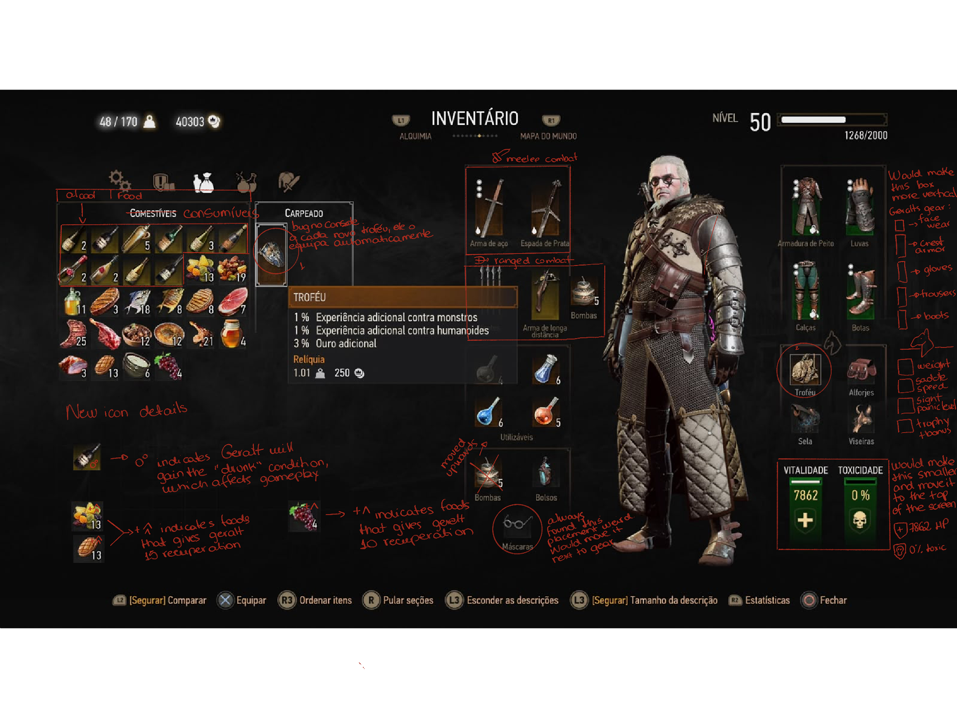
Main concern: The consumables require hovering to indicate their effects, and the gear-equipping slots require the player to scan the entire interface, which can lead to cognitive load, a higher learning curve, and fatigue to indicate their effects and the slots to equip gear have the player scanning the entire interface, which can lead to cognite load, higher learning curve and tiredness.
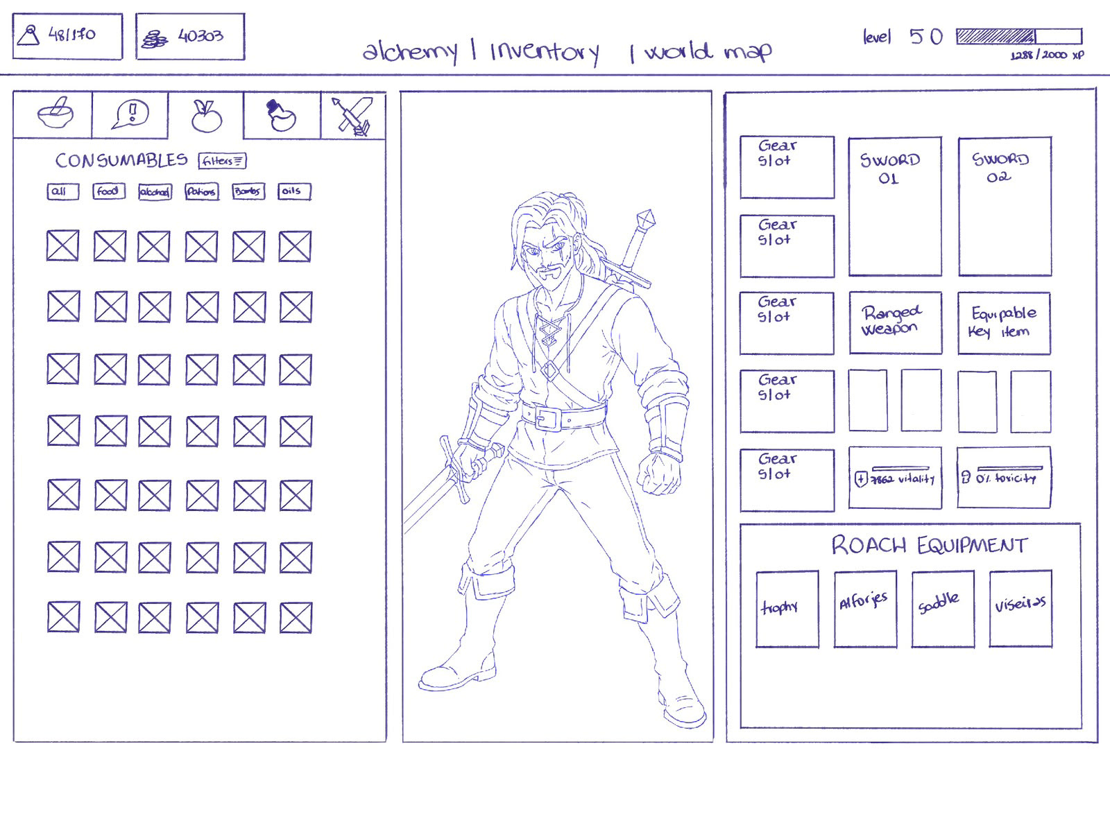
Hand drawn lowfi mock-up
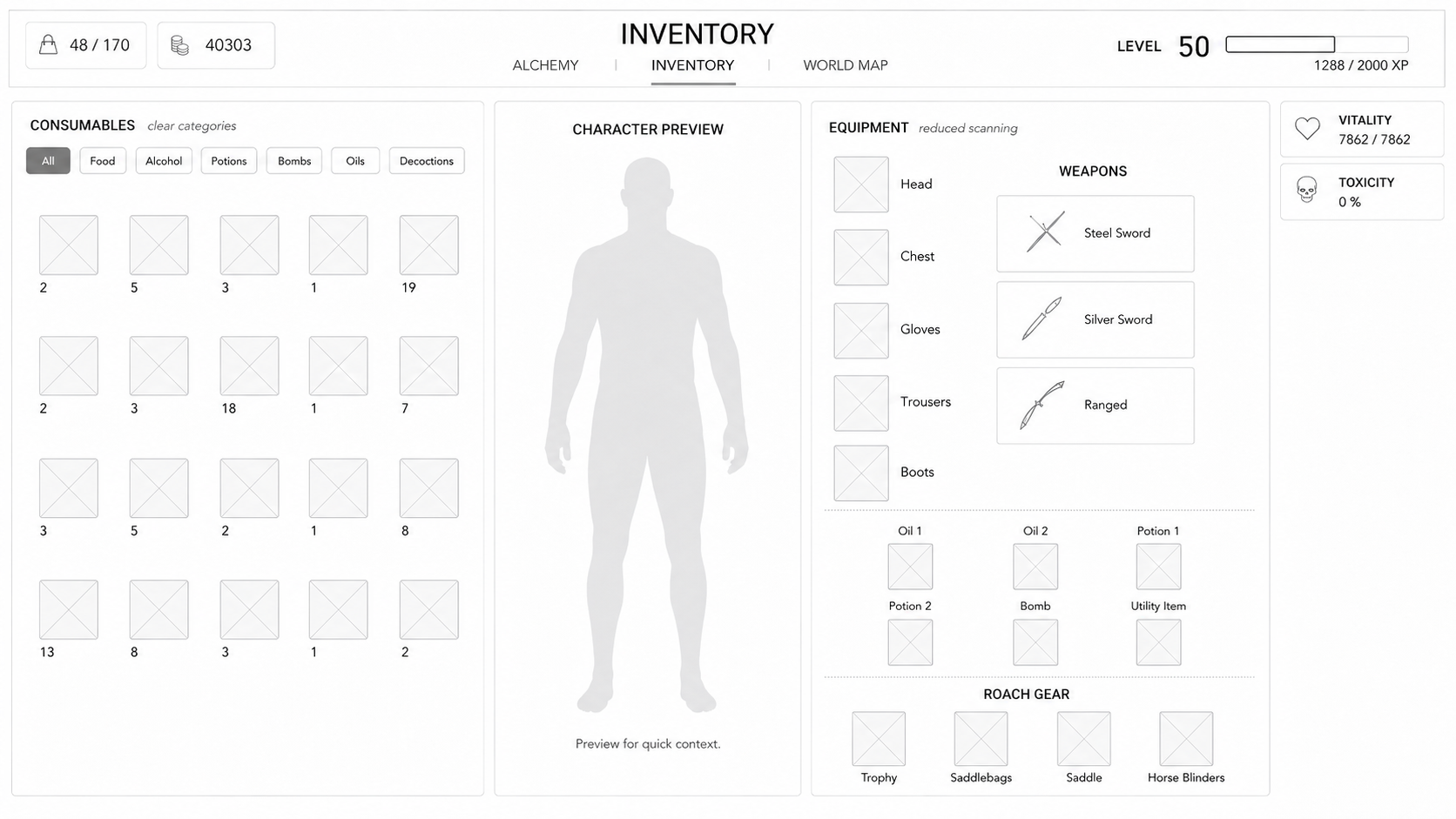
hifi mockup: wip
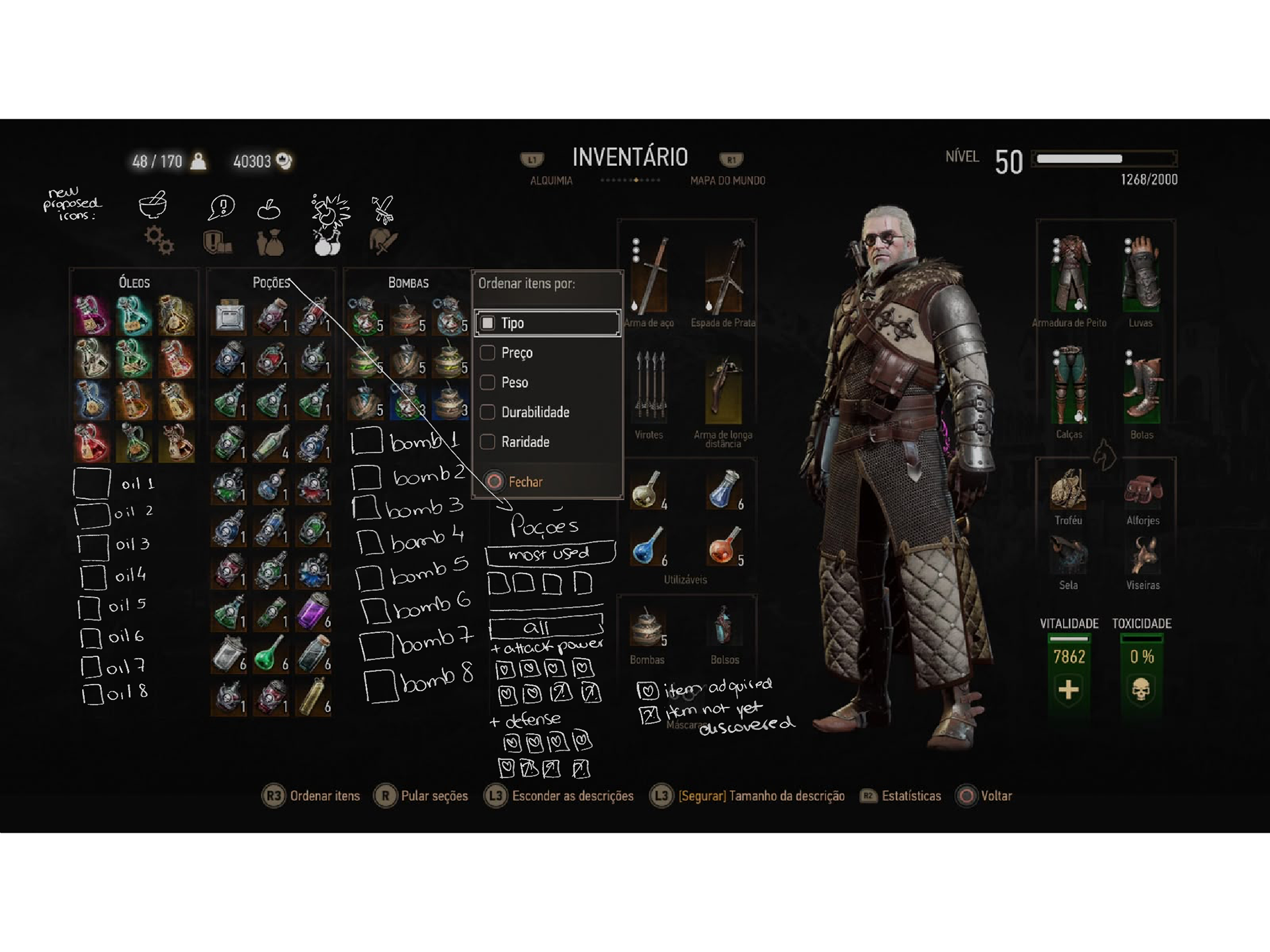
Main concern: using the oils, potions, extracts and, bombs are core combat mechanics; using these items are a recurring action and the way the game handles their organization lacks intuitiveness and ease of navigation. New players can already feel intimidated by the depth of the systems and the UI doesn't contribute to making the learning curve easier to face.
wireframe: wip
hifi mockup: wip
hifi mockup: wip
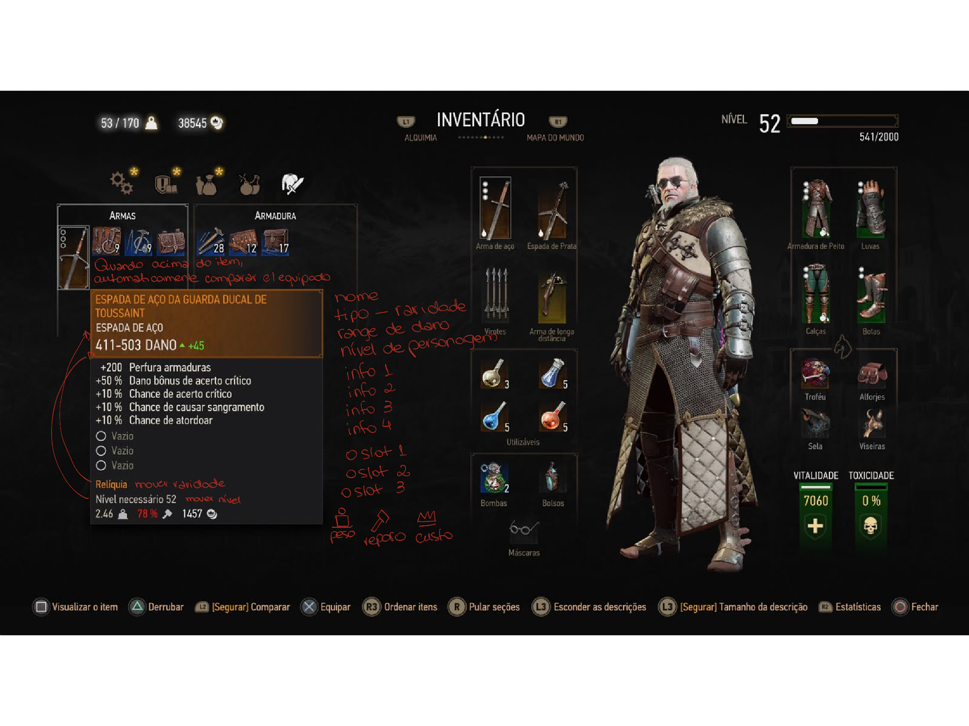
Main concern: the current gear pop-up does not present a problem, but I'd like to propose a few improvements for the ease of reading to allow the player faster decision making without spending several minutes reading through stats. I'd rearrange the order of the information and automatically compare to your equiped gear so it's easier and faster.
wireframe: wip
hifi mockup: wip
hifi mockup: wip
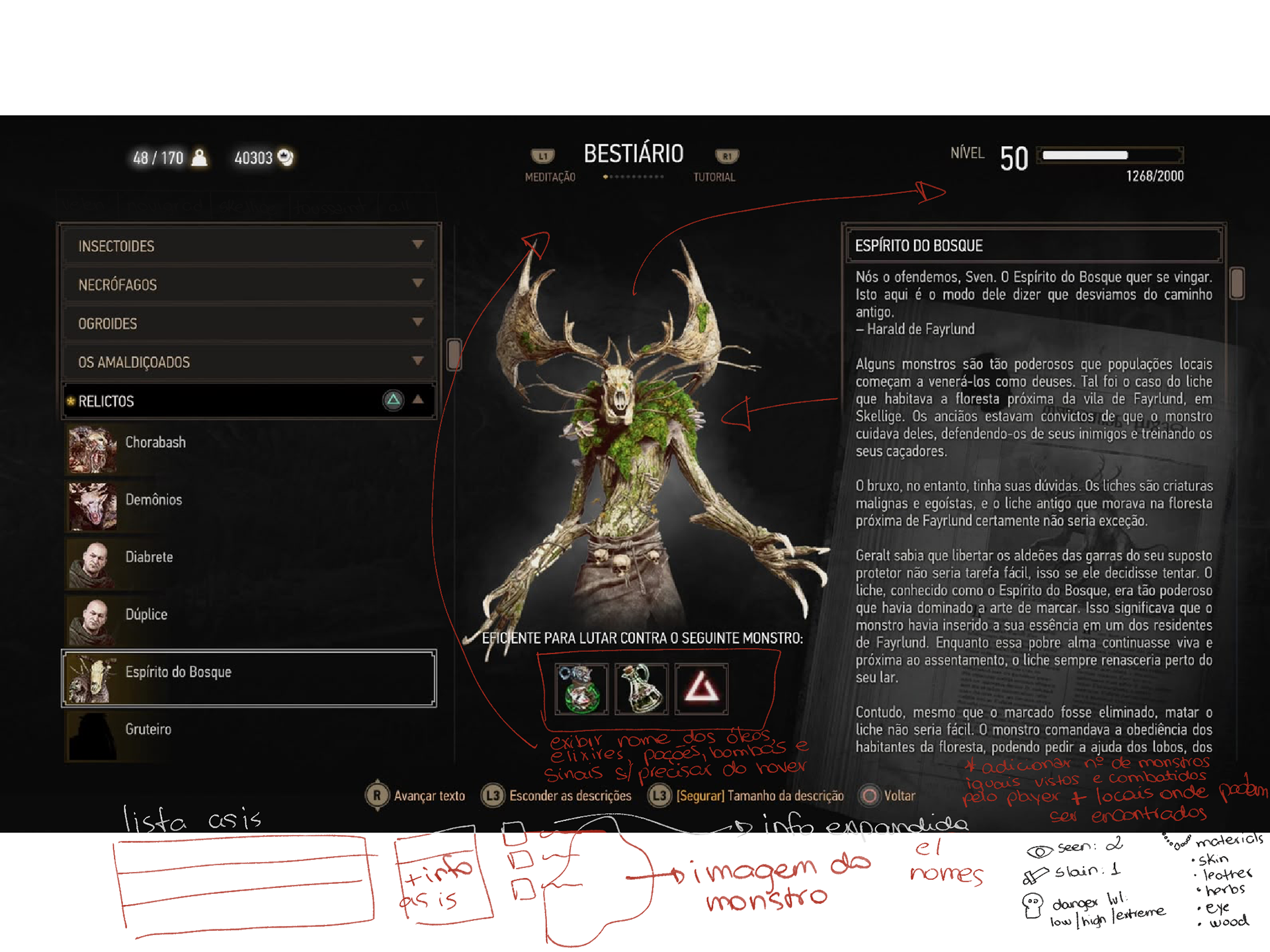
Main concern: Biggest improvement point for the Bestiary is changing not only the way the information is displayed to the player but also adding more information that would be valuable from both a mechanic and a lore standpoint.
The oils, bombs and signs have only their icons, but you have to hover over them to read which one it is (it's hard to memorize just from the art and they're all very similar).
Besides that change, I would add the information of how many of that creature the player has seen and how many they slew, including also which parts of the continent (be it available in -game or not) that creature can be found. It would also be interesting and helpful to add their loot when slain, so the player can look for alchemy ingredients if they need to.
The oils, bombs and signs have only their icons, but you have to hover over them to read which one it is (it's hard to memorize just from the art and they're all very similar).
Besides that change, I would add the information of how many of that creature the player has seen and how many they slew, including also which parts of the continent (be it available in -game or not) that creature can be found. It would also be interesting and helpful to add their loot when slain, so the player can look for alchemy ingredients if they need to.
wireframe: wip
hifi mockup: wip
hifi mockup: wip
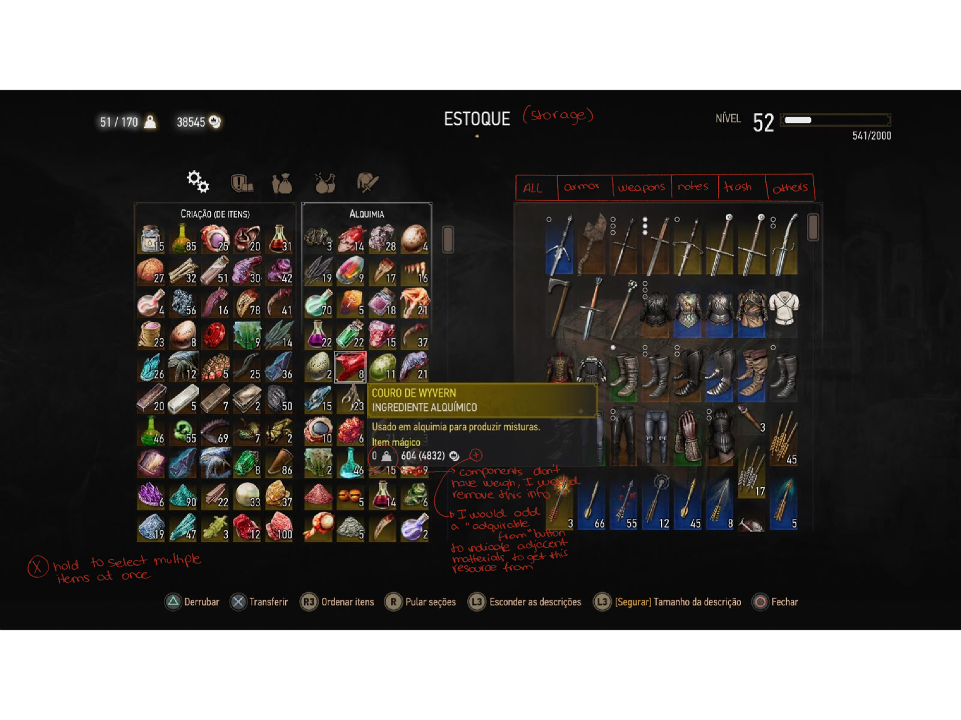
Main concern: I mean, just glancing at this screen, we can already realize we have a... situation.
For the storage system, it would be valuable and very handy for the player to have different tabs with classification for ease of navigation. The filters are useful, but are an extra step reliant on the player to start being useful.
For the alchemical ingredients, there no distinction between what they are and no available information within the game of how to acquire them (hence why previously I suggested on the bestiary screen I suggested adding where the beast can be located and what their loot ingredients are).
Having classifications as to what they are (herbs, monster parts, animal parts, concoctions, etc) would make browsing through them and understanding better what you require easier.
Also, from a gameplay standpoint, there's not much to be done in this screen besides checking how much of each you have, and there are more effective and cheaper ways to allow the player to check this information. Since most of the interaction the player has with these ingredients comes from the Alchemy screen and not the inventory screen with the ingredient list, this one could be far simpler or even redundant.
For the storage system, it would be valuable and very handy for the player to have different tabs with classification for ease of navigation. The filters are useful, but are an extra step reliant on the player to start being useful.
For the alchemical ingredients, there no distinction between what they are and no available information within the game of how to acquire them (hence why previously I suggested on the bestiary screen I suggested adding where the beast can be located and what their loot ingredients are).
Having classifications as to what they are (herbs, monster parts, animal parts, concoctions, etc) would make browsing through them and understanding better what you require easier.
Also, from a gameplay standpoint, there's not much to be done in this screen besides checking how much of each you have, and there are more effective and cheaper ways to allow the player to check this information. Since most of the interaction the player has with these ingredients comes from the Alchemy screen and not the inventory screen with the ingredient list, this one could be far simpler or even redundant.
wireframe: wip
hifi mockup: wip
hifi mockup: wip
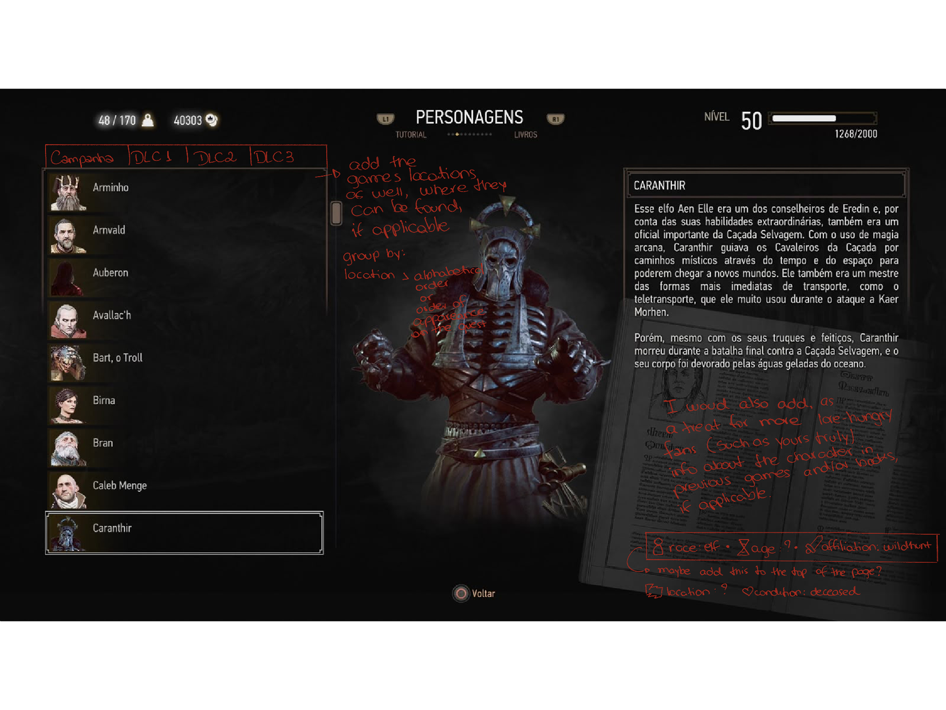
Main concern: Not much of a problem with this screen, but I would propose a new iteration. Since TW3 has such a deep and rich lore, full of incredible characters, it would be valuable to filter them through which content they were added to the game, the region they're in and from and also writen information about the character's appeareance in the previous games and or books, so the lore-hungry fans (such as myself and a great deal of the fan-base) can have more information and context about that character's motivation and their relationship with Geralt.
Since Dandelion's been with Geralt for a long while and hears all of his stories, he would have the necessary details (keeping it faithful to the game's lore) to add to the entry.
To make it a bit easier as well, I would add information such as their race, age, affiliations, location, and condition. Dear Caranthir, as depicted in the screenshot, has a deceased condition, happily.
The game also struggles a bit with making distinctions between characters and friendly beasts. Bart, the troll, for instance, although friendly, is still a troll and his information should be added to the beastiary.
Same as we have with a few monsters who are unique encounters with their own mechanics that might vary from the others in their species, the trolls should follow the same logic for ease of navigation and information discoverability.
To make it a bit easier as well, I would add information such as their race, age, affiliations, location, and condition. Dear Caranthir, as depicted in the screenshot, has a deceased condition, happily.
The game also struggles a bit with making distinctions between characters and friendly beasts. Bart, the troll, for instance, although friendly, is still a troll and his information should be added to the beastiary.
Same as we have with a few monsters who are unique encounters with their own mechanics that might vary from the others in their species, the trolls should follow the same logic for ease of navigation and information discoverability.
wireframe: wip
hifi mockup: wip
hifi mockup: wip